Well you know what I love best about Paint… It’s just paint!! You can change it whenever you need!! And that’s just what I did.
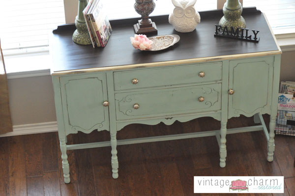
My painted buffet…
Since changing the wall color in our house a lot of the pieces I had were grey’s and neutral. Which was great but I kept looking at this piece and it was killing me!! I needed to change it and so I did.
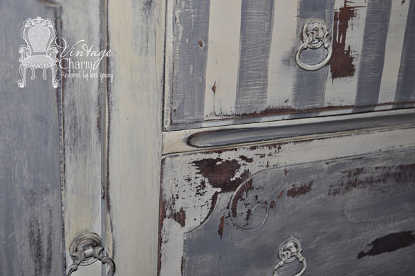
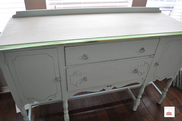
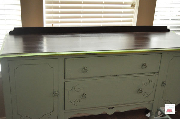
When I painted this the first time {just last year} I chose pattern and heavy distressing because of the imperfections in the piece. I don’t always embrace those imperfections but this piece was staying with me and I loved it.
Sometimes the best parts of a piece are the history and that happens to be the part of the story I love most!! So why hide it??
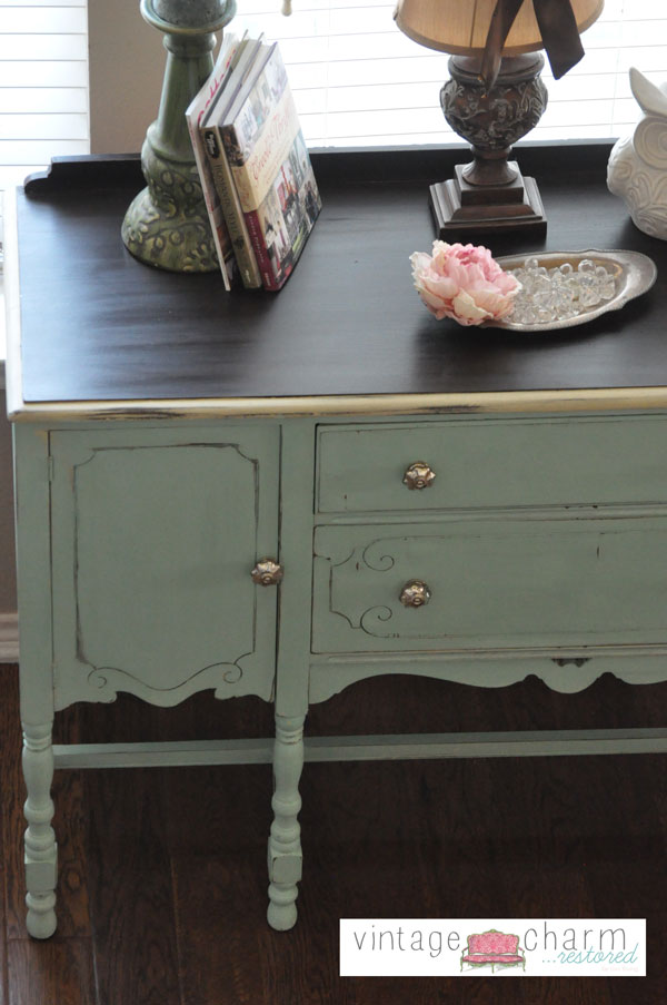
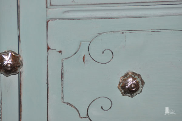
Choosing a color for myself is always harder than choosing for a client though. It’s totally about committing to the color. And so it’s no surprise to any of you that I went with an aqua color. But I wanted it soft and muted and possibly a little minty.
For this piece I chose APC Surfboard for the base. I had done this piece (click on bold text) in it and had 3/4 of a quart left so I wanted to use it up. {Which brings up another good point. I only used 1/4 of a quart to paint a double dresser- this paint goes a long way!!} When I painted the dresser I used dark wax to bring out the green undertones.. but that wasn’t the color I was going for… so I mixed paints to create the perfect color!!
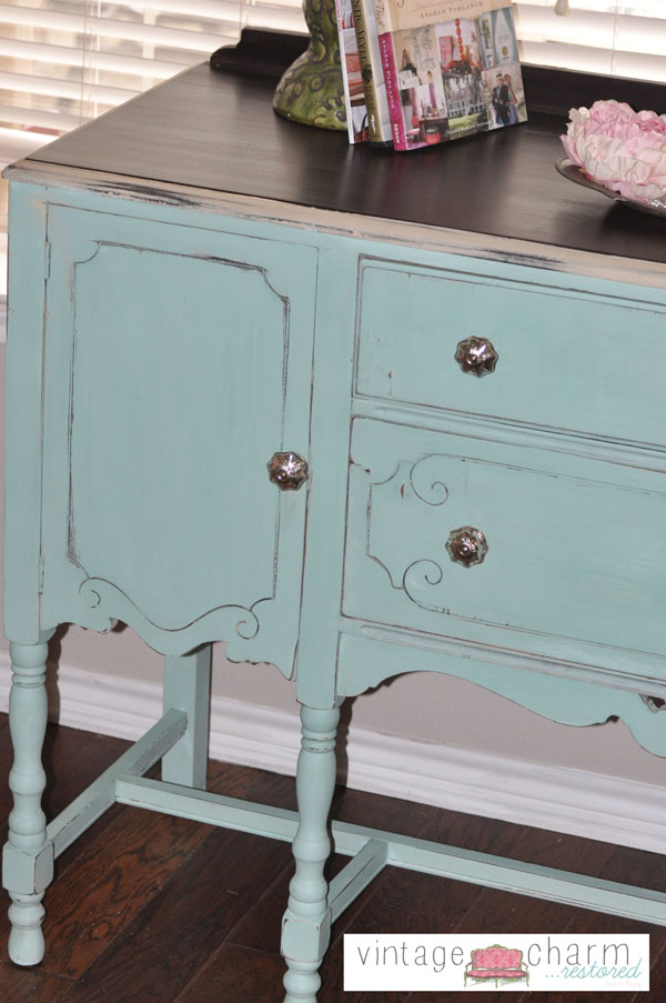
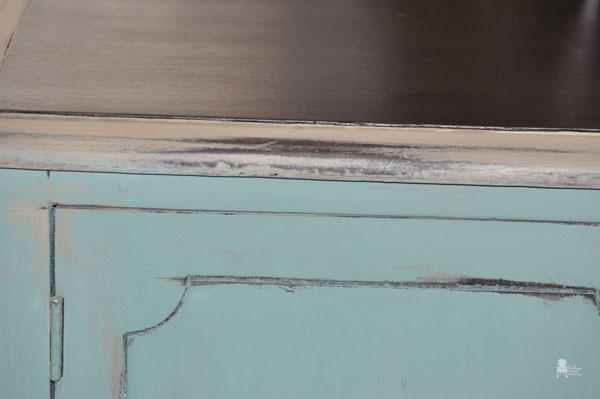
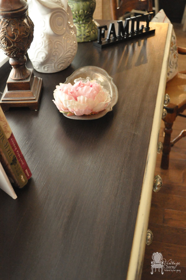
So American Paint Surfboard as the base and then I added a small pour of Homeplate {think Rachel Ray and pouring EVO out counting seconds for tablespoons equivalent- that’s how I measure}. I did the same with Rushmore and used a whole sample of Hometurf {yes bright green}… all that mixed together was minty aqua quart of goodness- and I have it almost all left because this buffet took nothing to paint!! So I am looking for my next victim(s). There are touches of this color everywhere in my house through pillows, throws, artwork… I love this color!! I am so thrilled I could mix it and have it to paint!! I used clear wax on the body and General Finishes Java Gel Stain on the top. Distressed just enough to let the old finish peek through. The band or trim around is the original finish I had done the first time… I left a little piece of it…
Enjoy!!
I think what I love best about this piece is how the color changes with cloudy days and sunny days… It’s so calming in the room and I just love it’s simple elegance!!
Thanks for stopping in!! ~Lori
Sharing at


Very pretty! I love vintage inspired painted items.
It turned out just beautifully!! I love that you kept the top stained.
I just love it Lori — It looks great!
Seriously. I had that identical buffet in college. It was the only piece of furniture I owned – LOL. I bought it for $20 at a Waco flea market. I refinished it through the years but it finally fell apart. Yours is wonderful.
That looks amazing. Love the color.
Love me some aqua and vintage, so I couldn’t pass this beauty up! Always beautiful work Lori. Pinned 🙂
The dark top is a wonderful contrast.
Beautiful piece of furniture, love your style.
Turned out so wonderful!! Love the style and LOVE the color!!!
I love your buffet! Super job!
Lori this turned out gorgeous! Thank you so much for sharing at Redouxinteriors. -K
What kind of finish did you use? Assume on the piece you used chalk paint?
I used American Paint Company-it is a chalk and clay based paint. I waxed with the Real Milk Paint’s carnauba wax and buffed to a hard sheen.